


 |
 |


As the last blending house in the United States, Cornell & Diehl prides itself on creating everything by hand. That ethos extends not only to tobacco, but how it's showcased. Employing a wide range of creatives and craftspeople, C&D delivers the highest expression of our coveted hobby, and does it the right way.
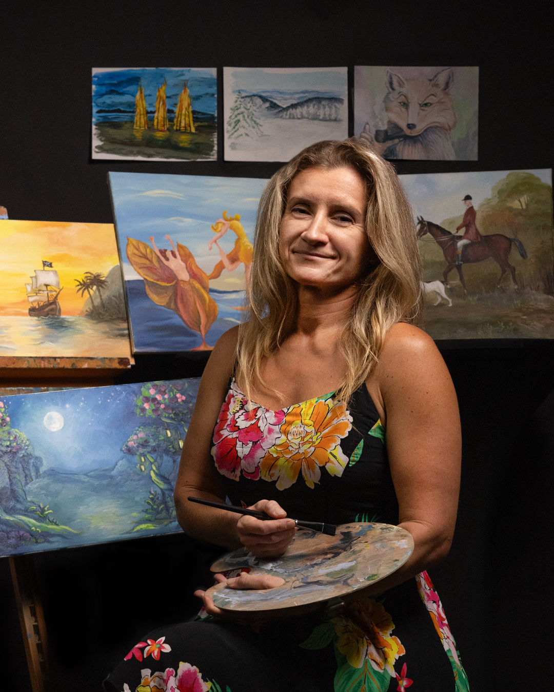
Among this cast of skilled artisans is Ania Nierwinski, Graphic Designer and the artist behind Cornell & Diehl's tin art. Ania has been at the company for six years, and in that time, she's transformed the way we approach label art. "When I first started working at Laudisi, it was all digital, mostly Photoshop," says Ania. "I started introducing more digital illustration, and at some point, we tried a more traditional approach of drawing and painting, then photographing it and transferring that to digital. It was an experiment that paid off because it allowed me to create a certain brand identity and feel for Cornell & Diehl, especially."
"Ania has definitely changed how I think about packaging as part of the story," says Andrew Wike, Vice President of Marketing. "I'm eternally grateful to her and her skill set."
Long before it reaches your bowl, every C&D pipe tobacco has a story behind it, and every detail, from leaf to label, is curated to tell it. "What's really cool about pipe tobacco, cigars, all the stuff we create, is that we're telling stories," says Andrew. "For people in our community — our hobby — the art is often their first signal of what they can actually expect from the experience. It sets the tone."
But how does that story start?
The Start of the Collaboration
The process usually starts long before Ania ever picks up a brush, with Andrew and Jeremy Reeves, head blender of Cornell & Diehl, discussing the feel of a blend C&D is working on. "A lot of times it's Jeremy and me just talking about tobacco and what we taste and experience," Andrew says. "He'll come up with something, I'll try it, and we'll share our thoughts. If you ever talk with Jeremy, sometimes those conversations aren't just about what you're tasting; it's about an experience."
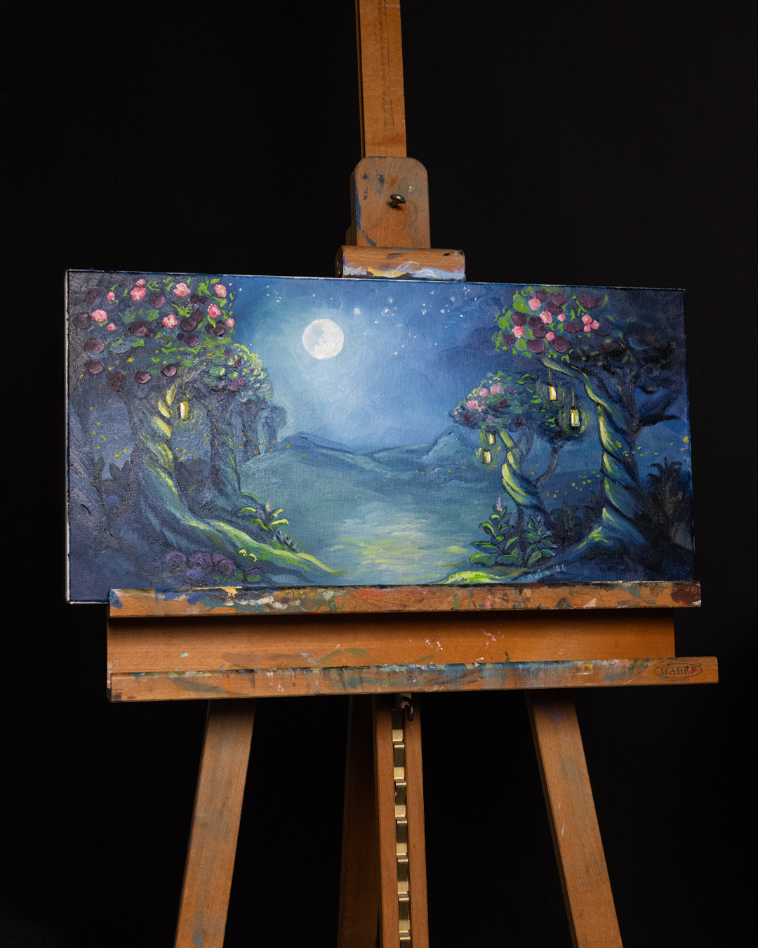
For example, the inspiration for Midnight Orchard, both the name and the art, came from one of these conversations: "We were just sitting here smoking it, and we were like, 'It's a midnight forest in bloom,'" says Andrew. "It was anchored in this feeling of Fernweh, a longing for somewhere you've never actually been. A lot of the time when we're coming up with new ideas, that's what we're chasing: an experience we can't really put into words. It takes Jeremy's experience on the blend side and a really strong name, but the artwork itself is part of that too."
Of course, everything at Laudisi is collaborative. It's not just one individual person or department making every decision; it's an on-going conversation across the company at large. Andrew explains:
"Anything we're putting our name on, we want everyone to believe in. If I don't have a clear idea of the direction, we'll talk about it as a group. We have so many people at Laudisi with interesting hobbies, who are really specialized in some niche of history or culture. It's really cool to have conversations with peers who get it, and then ask: How can I abstract this into something that captures what we're talking about and can actually be a product?"
It's oftentimes an interdepartmental endeavor that involves people outside of C&D and Andrew's Marketing team. "For example, Sykes came up with the concept and art direction for C&D's Summit Series, but Joshua Burgess gave the line its name," says Andrew. "And when working with Per Jensen on the limited-edition Aftensmad idea, Shane Ireland suggested leaning on Royal Copenhagen pottery motifs to better anchor the art in the time and place Per was targeting. A number of us all weigh in on what works, what doesn't, and where to take it. Even when an idea comes to me from someone else, it goes through that same process of collaboration."
Once an appropriate theme and mood are decided on, Andrew creates an art brief, a document for Ania with references and general guidelines. "Sometimes I don't have a clear picture in mind, but I have a feeling, and I can describe it in words. Ania knows I'm super excited about something if she gets a seven-page art brief from me. There are descriptions of what I'm going for and examples to look at."
Over the years, Andrew and Ania have developed a simpatico working relationship, built across countless releases. "Over time, I've learned more about her skill set," Andrew says. "I know what she's capable of, what I need to communicate to her in advance, and what I need her feedback on. So we've been able to do more and more interesting things."
Ania is, first and foremost, an artist, with a very clear vision when she gets to work. "She thinks about design from a fine-art perspective," Andrew says. "She's an excellent designer, very meticulous, and she'll definitely speak up if the kerning or leading is off. But she has a vision. If I come to her with an idea, to anyone else it might seem like I'm talking nonsense. If I say 'midnight forest in bloom,' that doesn't make any sense to most people. But Ania understands where I'm coming from and knows how to make it a reality."
Creating the Art
With the brief finished and a general direction decided on, Ania gets to work. Depending on the type of project and the amount of time she has, Ania decides which medium best suits the blend: "In certain cases, I keep the artwork to only digital media," she says. "In those cases, I draw illustrations in Adobe Illustrator with a digital pencil, then transfer them to Photoshop. In Photoshop, I add colors using different brush settings (so it's essentially like painting on screen). Once the main art is ready, I start working on font types and logos for the blend until I get the finished product."
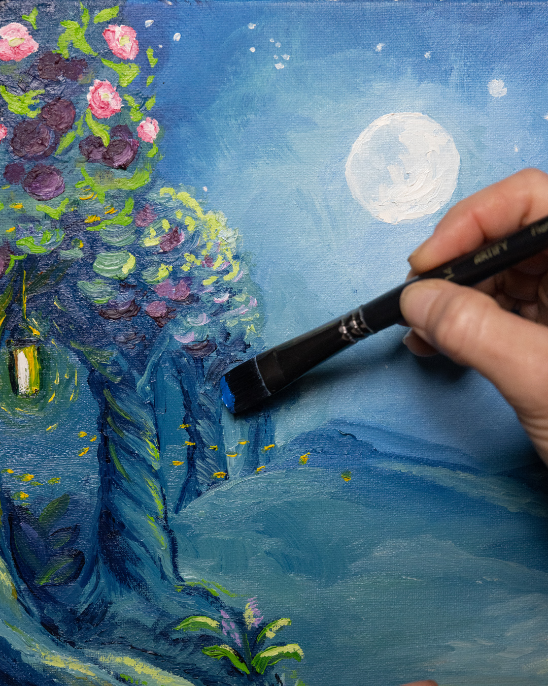
When she can, though, Ania prefers to do things analog, specifically drawing and painting on actual paper and canvas. She explains: "I enjoy the process, and appreciate the fact that there is no 'undo' button in real life. If you make a mistake, you figure out how it will become part of your art. That is what gives it personality and makes it special."
She tries to channel the essence of the blend, the distinct flavor associated with it, and represent that visually. There's an old culinary adage that we eat with our eyes first. Ania's art works the same way: "I always want to convey the taste or feeling while you smoke it with the visuals on the tin."
Depending on the project, the process can be laborious. For example, when crafting the art for Nørding's Hunter blends, manufactured by Cornell & Diehl, Ania had her work cut out for her: Each release in the series required a full-canvas oil painting.
"Erik Nørding is a big hunter, which you can see in his hunting pipes," says Andrew. "He's also a big fan of English-countryside, oil-on-canvas paintings. We thought it would be really cool to have English-countryside paintings of Erik on horseback with all these different hunting dogs."
Oil painting is a particularly difficult medium because it takes so long to dry. Each layer of paint has to dry before another can be added. Given the size and detail of the paintings, the process was protracted. "That project probably took six months, because so much of it was hurry up and wait," Andrew says.
The results, though, are inarguable. Ania says of the experience: "That was definitely a challenge. But the process is always rewarding."
Substrates and Typography
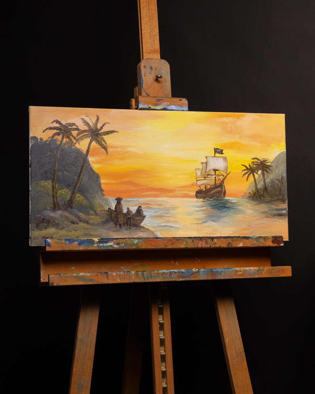
Even when a given piece of art is finished, there are still plenty of considerations to be made, like how to translate the full-scale art to a tin label — a whole process unto itself. "We typically take the canvases into the studio, shoot really high-resolution photos, bring those into Adobe, and build the label from there," says Andrew. "It's really difficult, especially with Cornell & Diehl labels, which are quite long and narrow. You're taking a regular portrait canvas and trying to figure out how to make it work on a very skinny label."
Then it's a matter of choosing the appropriate substrate: the paper the label will be printed on. Different substrates have different properties and can change the art's appearance, so choosing the right one is key to preserving Ania's intent.
"With Small Batch blends, we typically print on a more linen-like substrate because it gives a little texture and signals that it's different," Andrew says. "Especially with the art we're doing, it reads better on that textured canvas than on a flat matte surface."
Even the typography of every C&D label is painstakingly workshopped. "Typography is probably one of the hardest things in design," says Andrew. "There are so many options, so many ways to express something with type, and it's really hard to get perfect. It's probably the area where we iterate the most; the art's great, but there's something we need to tweak with the type."
When choosing a particular font, Ania and Andrew think about what naturally fits the blend and what they're trying to evoke, whether that be a particular time period or a particular mood.
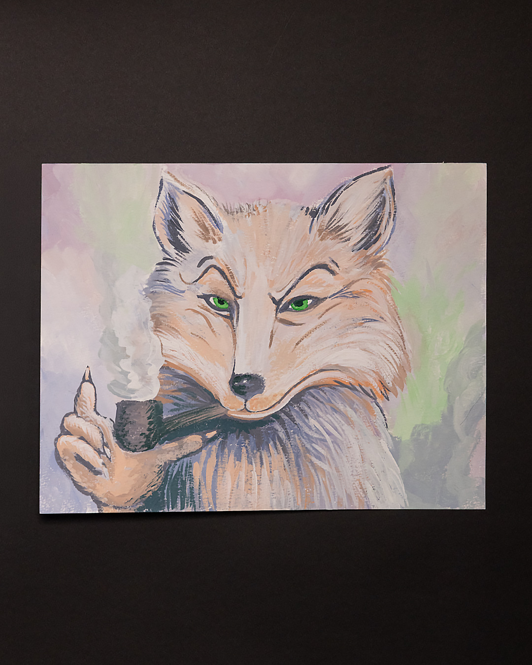
Sometimes that means manipulating individual glyphs. "We may really like a typeface but not the way an 'R' renders, for example, so we'll go in and manipulate the actual 'R' glyph," says Andrew. "That gives us a lot of leverage. Even down to that, it's custom. It's not just, 'Here's Baskerville. Throw it on a label.'"
All that attention to detail results in typography that's inextricably linked to the blend. The Old Ones series, for instance, boasts an appropriately haunting font that's as synonymous with the blends as the art and the tobacco itself. "The typography is part of the storytelling and part of the message," Andrew explains. "It's the name of the blend. You want to associate a certain feeling, for lack of a better word, a certain vibe, with reading that name for the first time."
Wrap Up
"We treat everything as a craft," Andrew says. "When we're designing labels and packaging, we put as much effort into that part of the craft as we do into the actual blend." That sentiment extends to everything we do at Laudisi. We're a collective of like-minded creatives and craftspeople working together to deliver singular experiences, and that hinges upon more than solely the pipe, or tobacco, or cigar; it's dependent upon the label, the art, the typography. We're devoted to every facet of the hobby, and to bringing it to you as close to perfection as we can.


You may also enjoy:



Comments
Great article. I’ve definitely noticed the change in C&D / G. L. Pease / Low Country / Nording tin art and it’s nice to see that there’s a real artist behind those images. A pretty tin won’t make up for a bad blend, but I appreciate the care that goes into it—it’s a way to demonstrate pride in your work.
I won’t feel compelled to buy the artist editions of blends I don't enjoy enough to cellar, but I’ll admit that the art on the Briar Fox tins helped me to choose what to buy as my “price of admission” at my local B&M.
Thank you for this article. I've always appreciated the tin art from C & D and now I know why and appreciate it even more. For me, it definitely adds to my enjoyment of the tobacco.
this is a fantastic essay. it's one of the clearest explanations of how and why the process of creating art is as or more important than the end result. and why it's important to have humans creating.
Very interesting article. I never realized how much is involved in labeling artwork. Fascinating! I appreciate fine tin art. I save all my empty tins so I can have a tin artwork collection. The Midnite Orchard label is one of my favorites. The blend was good too. Glad I got two, so I can go back to it in a couple years to see how it ages
Very interesting article. I never realized how much is involved in labeling artwork. Fascinating! I appreciate fine tin art. I save all my empty tins so I can have a tin artwork collection. The Midnite Orchard label is one of my favorites. The blend was good too. Glad I got two, so I can go back to it in a couple years to see how it ages
The artwork is beautiful! The Briar fox above should be used often! Grassroots is a pipe smoker today in the USA! What a wonderful read!
I'm very grateful to Laudisi for continuing the tradition of artistic expression on their tins, especially in the age of generative AI trying to claim the niche. The human touch is irreplaceable and highlighting how important it is and how much passion there is held for it is a wonderful gesture and makes me love the brand all the more. Great article, thank you Ania, Davin and Andrew!
While I appreciate the hands-on approach to the artwork being made now, the original artwork of C&D stood out. Exhausted Rooster, Gentlemen Caller, the original 5 ’o’ clock shadow is what drew me to C&D. Something has been lost in the transition,
The Briar Fox artwork brings back fond memories for me. I chatted with Peter Heeschen several times and shared memories of our late wives. Peter made a pipe for me in 2003 and I cherish it. The Briar Fox artwork captures his essence perfectly. I miss him.
The last blending house? LJ Peretti makes their own blends. For 156 years and counting.
I loved reading about this! Good tin art really does enhance the experience of a blend for me, just like a enjoying a pipe with a lovely view in front of me. I also appreciate how you guys have been going back and redecorating old hits like Haunted Bookshop (though I don't like that blend, I DO like the new artwork). I've been thinking it would be really cool to see that on other old C&D faves like Old Joe Krantz, or a personal favorite of mine, Cordial! Keep up the great work!